
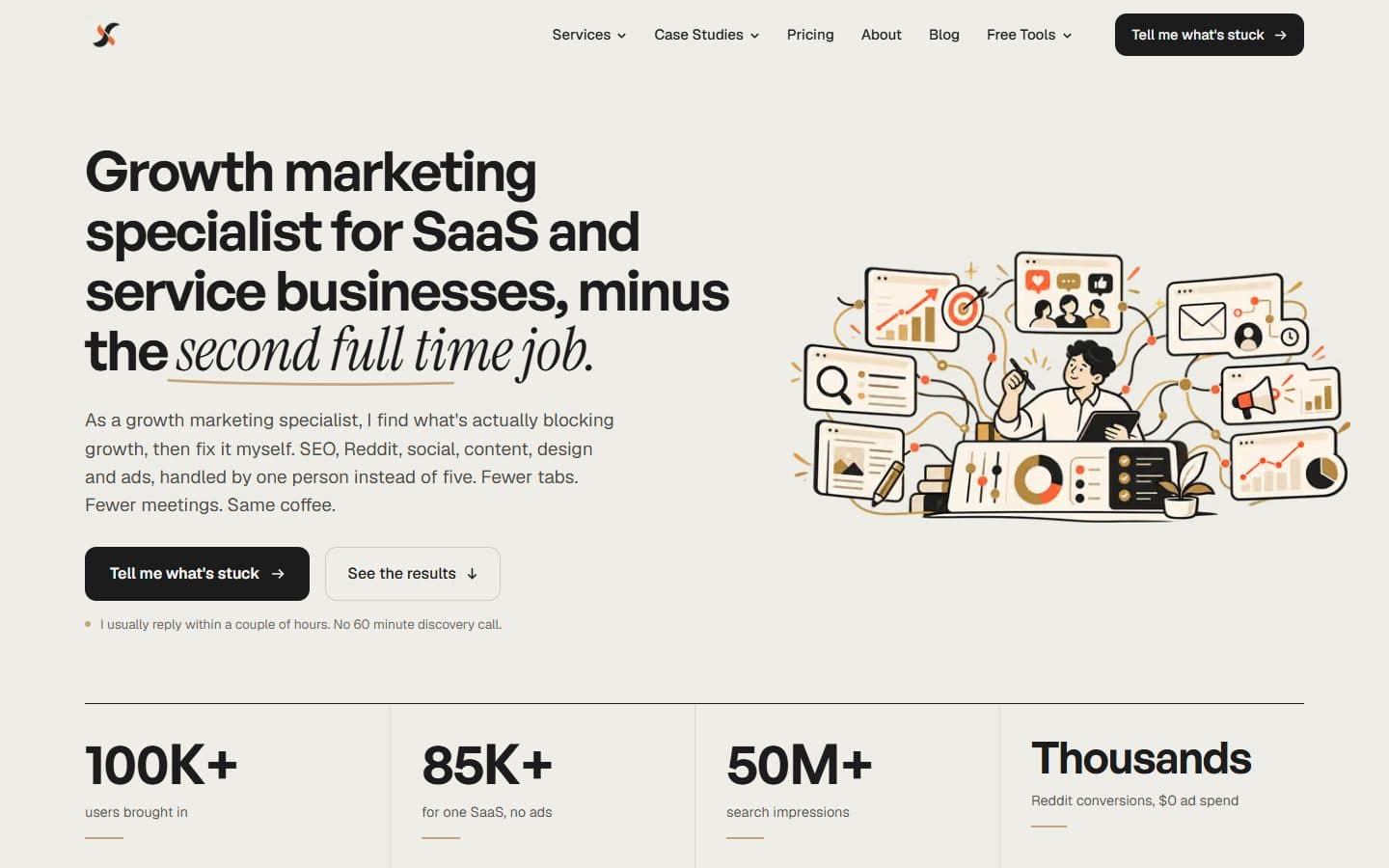
A cleaner way to explore the website
I wanted the site to do a better job of explaining what I do, showing the work behind it, and helping visitors find what they need without clicking through endless pages.
The redesign brings those pieces together with a cleaner layout, more consistent typography and clearer navigation.
What changed
- Updated the homepage layout and content hierarchy.
- Improved typography, spacing and page consistency.
- Made services easier to discover.
- Improved the presentation of portfolio work and results.
- Organized resources and tools into clearer sections.
- Improved navigation across desktop and mobile.
Why it matters
Whether you're here to explore my marketing work, hire me for a project, read an article or use a free tool, finding your way around should take less effort.